Intuit UK
UX research, wireframing

Intuit UK was experiencing customer churn, drop-offs, and confusion with the pricing page on their website. In anticipation of launching several new products, they needed help optimizing the experience to ensure that users always selected the right plan and products for their needs.
My task was to develop wireframes for a new pricing page layout and checkout flow, working with the strategy team on research and exploration. I began with an audit of the current Intuit page as well as top competitor pricing pages, and met with Intuit stakeholders to determine priorities for an updated pricing section. I reviewed site data with their web analytics team, incorporating heat maps, session recordings, and click reports into our research.
To complete the research section of the process, my team conducted interview with users within our persona types, following a discussion guide that we designed to probe into user motivations, frustrations, and needs. These 45-minute video sessions were invaluable to informing our next stages of ideating and wireframing.

“It needs to have an understanding of the naive user.”
“I don’t need my accounting software to be beautiful, I need it to work.”
“I wanted to be able to see a direct comparison then break it down more.”
“If you hadn’t called it out, I never would have noticed it. It’s not something that I would click on.”
“The first word I would use is upsell, because you've told me it's 11 pounds a month, but now you're telling me it's a bit more.”
“It was clear which one would work best for me and my business.”
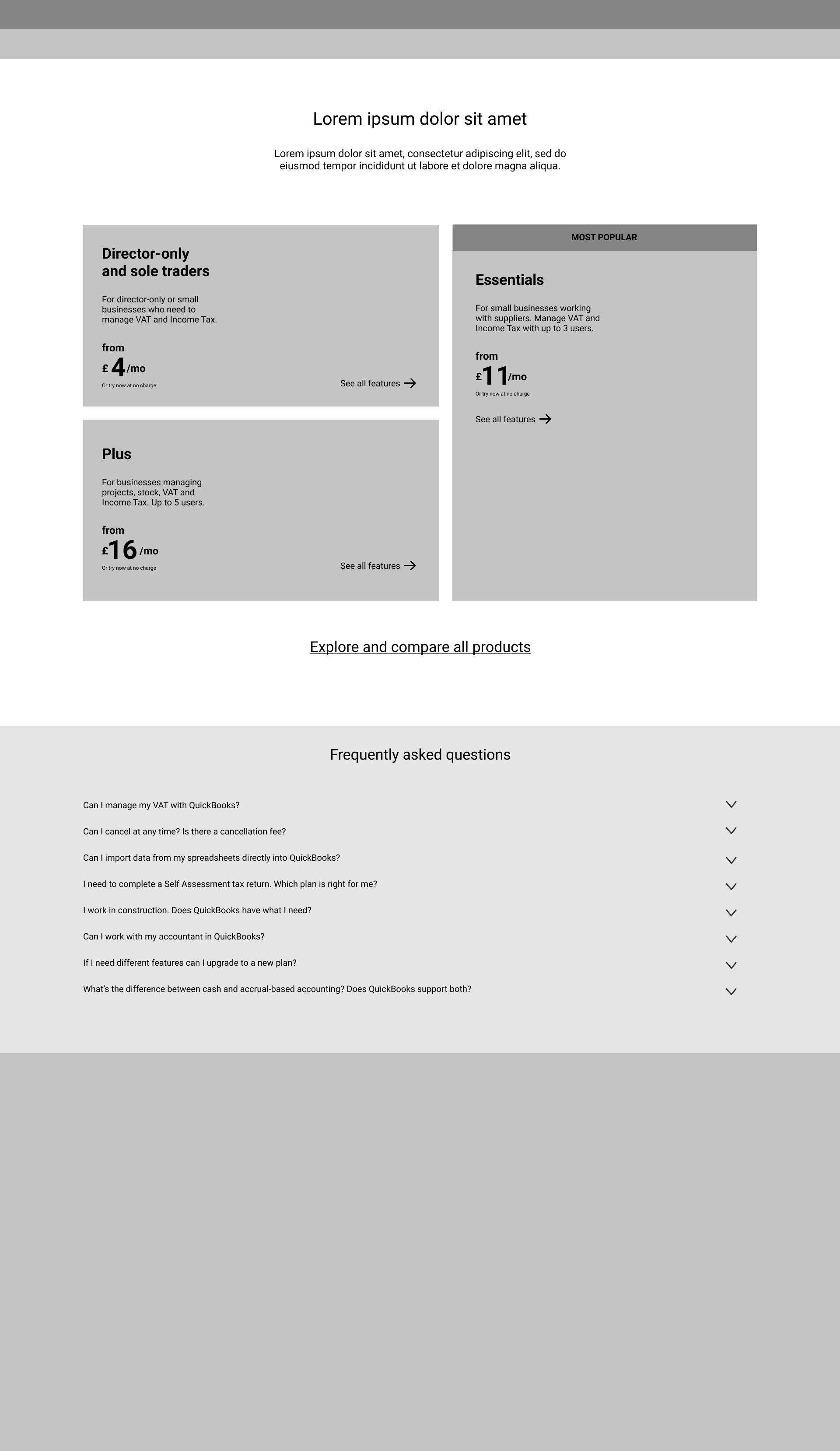
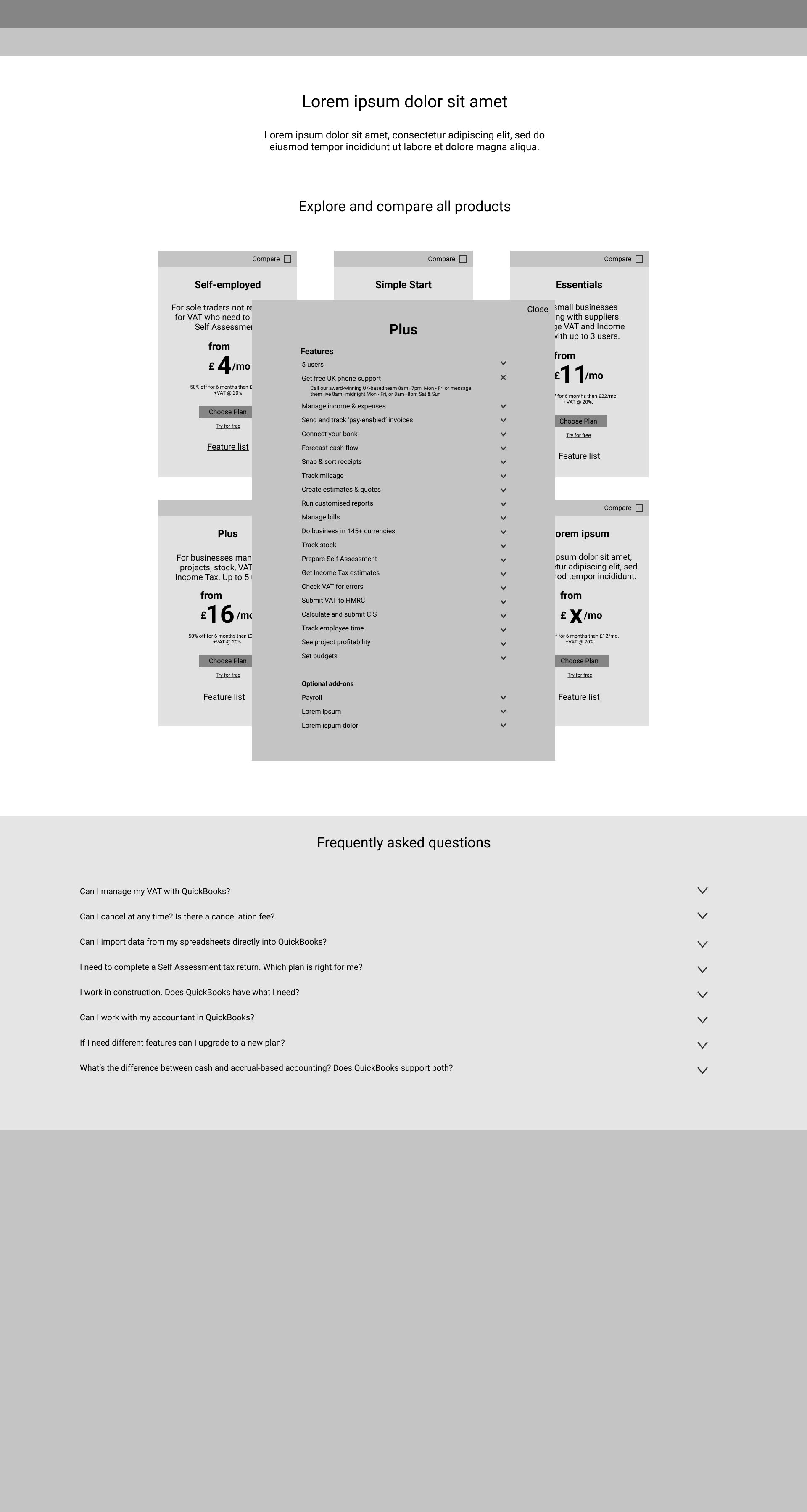
Once our research was synthesized and we identified key pain points and needs, I began the process of wireframing. The design went through a few stages of iteration, starting with sketches and ending with a multi-page pricing page and checkout flow. Beyond user concerns, one of the main points of consideration was the need for product expansion. Intuit was expecting to introduce multiple new products in the coming months and we had to find a balance between providing all the necessary product information without overwhelming the user.
To address this need, I designed a pricing landing page with sections defined by use case. One of the insights from our research showed that users look for descriptions that fit their profile, such as business type and size. The sections allow for users to see an overview of offerings without being overwhelmed by options. From the client’s perspective, the sections allow for growth as each section can have multiple products organized under each use case.
Other user concerns that were addressed: more transparent pricing, more digestable feature tables using sticky headers, and a clearer checkout flow that tells users where they are in the journey.